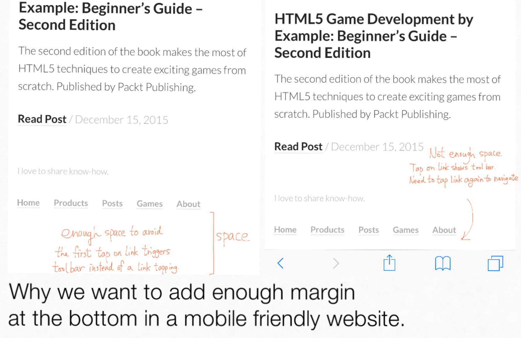
Add margin at the bottom for easier links tapping in mobile safari
When designing web page for mobile device, I always leave some space at the bottom. Especially when there are footer links. That’s because in mobile Safari, tapping on the very bottom of the screen will toggle the toolbar, which hides when you scroll down the page. And so when user wants to tap on a footer link, the first tap is great as toggling the toolbar and the link tapping is discarded. The visitor needs a second tap on the link. This is confusing to the visitor.vthats why I always leave some space at the bottom, so that footer link can be tapped and loads at the first tap.

Published on 2016-01-12 by Makzan.
More articles like this:
-
UI Design
-
Web Technologies
Previous ← A tiny drawing
Next → The CSS first-letter not working for inline